Splice is a 2009 sci-fi thriller directed by Vincenzo Natali. The setting of the opening titles is a fluid-filled womb with the titles growing out of the side or being suspended in the liquid. They were designed by Kook Ewo in an extensive pre-production process. The titles set the tone for the film.
The start of the titles begins with a bird and fish skeleton. These merge into a word (the production company) composed of simple small white letters that contrast with the deep blue background. This is accompanied by discordant music and sliding sound effects as the images change. This noise puts the audience on edge and the contrast between the letters and background allows the audience to focus more on the images rather than the words.
The discordant sounds, similar to something moving through liquid, continue throughout the opening sequence but are layered over with classical piano music. As the titles proceed, the discordant sounds grow louder and eventually the piano can no longer be heard. This suggests to the audience that something will be hidden through the film but will eventually become apparent.
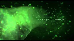
This is an example of some of the images show in the opening titles. The background is black with the green over the top. This is the same colour scheme throughout - dark and murky suggesting that the film will be negative and have dark secrets.. The titles appear regularly on the screen. These ones move along with the green flow giving the impression that action will occur the entire way through the film.
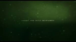 This is similar to the image above. The words are suspended in a murky dark liquid. As they move on and off of the screen, sound effects make it sound like it is moving through liquid. This makes the audience feel on edge as the sound and image is unpleasant.
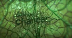
These words are different. This shows that they are more important as they are bigger letters and part of the titles itself (being the same colour) rather than just being layered over the top. The letters appear to be growing out of the membrane of the image making the audience even more uncomfortable and maybe even frighten them a little.
Source used: http://www.artofthetitle.com/title/splice/
No comments:
Post a Comment