Tuesday, 7 April 2015

Monday, 30 March 2015
Wednesday, 25 February 2015
Mixcraft and Titling
With the deadline fast approaching, the group has been working hard. We have been working mostly on titling and music.
Using Adobe After Effects, we have been creating simple titles that allow the audience to focus on what is on screen rather than focus on the words too much. We have chosen a simple white colour and a simple font in order to do this.
The music is proving to be more challenging, however we are continuing to preserve with it. Using Mixcraft, we are creating our own version of the American Horror Story opening music as we believe it would fit well with our piece. It is difficult to get the music to match the camera shots, but we will continue to keep trying until we achieve something that works well.
Monday, 23 February 2015
Target Audience and Their View of Our Piece
Feeling that we have almost finished our piece (with only music and some titling to complete), we have asked some members of our target audience of their view and how we should improve it.
Many of the comments we received were positive, but as always, there was some room for improvement. There were a few issues with sound transition and distortion as we moved from and exterior shot to an interior shot. Some shots were too long or slightly out of focus. There were also a few other little bits to correct and amend.
In the rest of our remaining time, we will work on the comments presented to us by the target audience before showing it to them again. This will allow us to gather final comments and make final additions.
Friday, 20 February 2015
Continuing to Film
Our deadline is fast approaching as we only have two weeks left to edit our final thriller piece. In the past few weeks, we have made significant progress with our project. We have managed to re-film the necessary parts as well as have made significant progress with the editing and it is finally starting to take shape.
However, we did have a few issues filming. During our first session, the camera made focusing sounds that we didn't want, so many of these shots had to be redone. There was also an issue with some of these shots being shaky, due to a un-level surface and a wonky tripod, so we have re-filmed those too.
We will continue to edit until we are happy with our final piece, being critical and analytical about it. We will also ask our target audience their view of the piece so that it appeals to them and meets their criteria.
Monday, 2 February 2015
Beginning to film
Our deadline for our thriller piece may be on the 6th of March, but that isn't as long as it seems so we have already begun to film for our final opening sequence.
For every chosen shot, we filmed in several times. Some of this were the same while some were different. This was so we has lots of footage to choose from when editing. We could also cut and put together different shots to achieve what looks the best.
Filming this early means we can go back and re-film and shots that are out of focus, have continuity errors and are not quite right for our film. Being this organised also allows us to spend longer on editing to make sure the thriller opening is the best as we can produce and meets our target audience's needs.
Saturday, 24 January 2015
Textual Analysis - Splice
Splice is a 2009 sci-fi thriller directed by Vincenzo Natali. The setting of the opening titles is a fluid-filled womb with the titles growing out of the side or being suspended in the liquid. They were designed by Kook Ewo in an extensive pre-production process. The titles set the tone for the film.
The start of the titles begins with a bird and fish skeleton. These merge into a word (the production company) composed of simple small white letters that contrast with the deep blue background. This is accompanied by discordant music and sliding sound effects as the images change. This noise puts the audience on edge and the contrast between the letters and background allows the audience to focus more on the images rather than the words.
The discordant sounds, similar to something moving through liquid, continue throughout the opening sequence but are layered over with classical piano music. As the titles proceed, the discordant sounds grow louder and eventually the piano can no longer be heard. This suggests to the audience that something will be hidden through the film but will eventually become apparent.
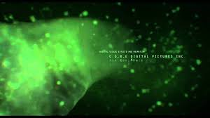
This is an example of some of the images show in the opening titles. The background is black with the green over the top. This is the same colour scheme throughout - dark and murky suggesting that the film will be negative and have dark secrets.. The titles appear regularly on the screen. These ones move along with the green flow giving the impression that action will occur the entire way through the film.
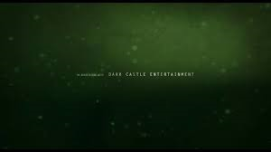 This is similar to the image above. The words are suspended in a murky dark liquid. As they move on and off of the screen, sound effects make it sound like it is moving through liquid. This makes the audience feel on edge as the sound and image is unpleasant.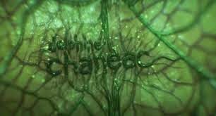
These words are different. This shows that they are more important as they are bigger letters and part of the titles itself (being the same colour) rather than just being layered over the top. The letters appear to be growing out of the membrane of the image making the audience even more uncomfortable and maybe even frighten them a little.
Source used: http://www.artofthetitle.com/title/splice/
Tuesday, 20 January 2015
Sunday, 18 January 2015

Thursday, 8 January 2015
Storyboard Creation
In order to successfully produce an opening for a thriller film, we have created a storyboard. This will be used to make it how we wish it to be and not forget anything. However, this is a loose guideline and our ideas may change.


Creating Our Pitch
When planning our thriller film, we created a pitch to present to the film organisation.
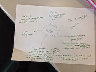
Our film was to be a thriller. We chose to do a psychological thriller that includes aspects of horror. We decided this because we thought it would appeal most to our target audience. The length will be approximately 120 minutes long with the tag line 'Don't play her game; you'll lose'.
The title will be 'Hello' and is a significant part of the plot. Our protagonist will see this word everywhere and be haunted by it.
The target audience we have is a certificated age of 15. We aim to attract a mass audience aged between fifteen and eighteen. We are aiming at a young audience because they can relate more easily to our young actors. 15 is believe to be a suitable age rating for our film as it will include deaths and strong language in particular scene, but this will not be too extreme. We believe that it will be used by people as escapism.
The first few opening scenes will be in Eastwood Park in Hasland, a house and the street leading to this house.
The basic theme of the film will incorporate parts of 'The Roommate'. It will be about a young girl who is living a seemingly normal life when she suddenly starts noticing differences in her everyday life. She starts seeing the word 'hello' everywhere including it being written on walls, in alleyways and even in her own home. She begins to get paranoid and things begin to spiral out of control.
Wednesday, 7 January 2015
Planning to Film
In order to plan our filming times, we have created a timetable demonstrating the days of the month. On to this, we have stuck on sticky notes showing when people are availible and when they are not. We have done this to plan when we will film. We have done similar timetables for January and February where we can track our filming process.

Tuesday, 9 December 2014
Harry Potter Warner Bros. Studios
I visited the Warner Brother studios in London. This is both useful for my exam and the coursework. The visit gave me an insight into the detail, depth and preparation it has taken to produce such big films.
I discovered that many models have been created within the production process before the sets were created. The sets have extreme detail and are constructed with care. Many hours were taken in the make-up and costume. Special effects were created using green screen and computer generated images.
While our group cannot replicate the same level of technology and detail, we can take what we found out into consideration. We have learnt the importance of continuity and costume. We may also consider using green screen in some aspects of filming.
 |
| Great Hall model |
 |
| Goblet of Fire costumes |
 |
| Wigs |
 |
| Make up |
 |
| Various props |
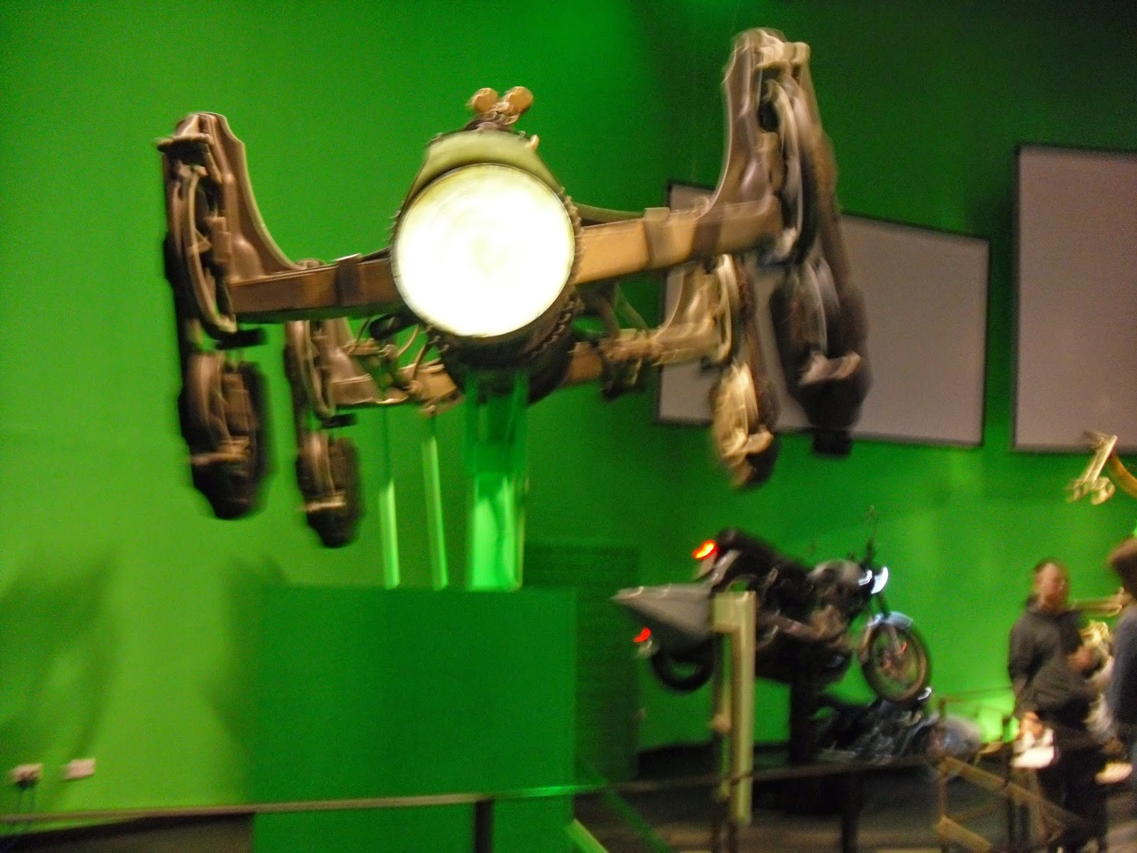 |
| Green screen carts in Gringotts |
 |
| Prosthetics for the Goblins |
 |
| Diagon Alley Set |
 |
| Models of the sets |
 |
| The Hogwarts model |
Wednesday, 3 December 2014
Textual Analysis of Buried's Titling
http://www.artofthetitle.com/title/buried/
Buried - 2010
Plot: Paul is a U.S. truck driver working in Iraq. After an attack by a group of Iraqis he wakes to find he is buried alive inside a coffin. With only a lighter and a cell phone it's a race against time to escape this claustrophobic death trap.
Duration: 95 minutes
Genre: drama, mystery, thriller
Released: 29th September 2010 (UK)
Rated: 15
Starring: Ryan Reynolds, Robert Paterson, Ivana Mino


The title of the film appears swiftly as the word 'buried' scrolls up the screen. This makes it appear as if the camera is moving down through the ground. It is positioned on the bottom right of the screen and takes up approximately a quarter of it suggesting that the title closely links into the film itself. It is a yellow/brown colour linking to the underground/buried theme of the film. It is a basic, quite bold font that allows the audience to easily read it. The letters then fade as they travel up the screen.
The photo of money appears to be cut into strips and is accompanied with small writing. This shifts in a diagonal movement from the bottom left-hand corner to the top right. The people's names are written in white and their role in the film production is in yellow. Both have the same font but the white is slightly larger suggesting the names are slightly more important.
All of the titles appear to move upwards suggesting a feeling of travelling down through the ground. They are all on a black background suggesting the dark will be a prominent feature throughout the film.
Buried - 2010
Plot: Paul is a U.S. truck driver working in Iraq. After an attack by a group of Iraqis he wakes to find he is buried alive inside a coffin. With only a lighter and a cell phone it's a race against time to escape this claustrophobic death trap.
Duration: 95 minutes
Genre: drama, mystery, thriller
Released: 29th September 2010 (UK)
Rated: 15
Starring: Ryan Reynolds, Robert Paterson, Ivana Mino
The title of the film appears swiftly as the word 'buried' scrolls up the screen. This makes it appear as if the camera is moving down through the ground. It is positioned on the bottom right of the screen and takes up approximately a quarter of it suggesting that the title closely links into the film itself. It is a yellow/brown colour linking to the underground/buried theme of the film. It is a basic, quite bold font that allows the audience to easily read it. The letters then fade as they travel up the screen.
The photo of money appears to be cut into strips and is accompanied with small writing. This shifts in a diagonal movement from the bottom left-hand corner to the top right. The people's names are written in white and their role in the film production is in yellow. Both have the same font but the white is slightly larger suggesting the names are slightly more important.
All of the titles appear to move upwards suggesting a feeling of travelling down through the ground. They are all on a black background suggesting the dark will be a prominent feature throughout the film.
Saturday, 29 November 2014
Audience Theories
Uses and Gratifications:
The theory was developed by Bumler and Katz. It suggest that audiences use any media text for various reasons as suggested below:
- Diversion (Escapism) - escape from everyday problems and routine
- Personal Identity - finding yourself reflected in texts, learning behaviour and values from texts
- Personal Relationships (Social Interaction) - using the media for emotional and other interaction e.g. substituting soap operas for family life
- Entertainment - Using the media as a source of entertainment
- Surveillance (Information) - Gathering information from the media e.g. documentaries, weather reports
We will consider why our audience will be watching our thriller piece and take this theory into consideration during production.
Hypodermic Needle:
According to this theory the media is like a syringe which injects ideas, attitudes and believes into the audience who have little choice but to be influenced. For example, according to the theory, if you watch something violent you will be inclined to do the same violent thing.
We need to take this theory into consideration when making our film. Our piece may have scenes of violence or stalking and we need to consider how this will effect our audiences.
Active/Passive Audiences:
An active audience is an audience that thinks about what they have seen on screen after watching it. What they see has the potential to affect them physiologically. A passive audience is the opposite of this and they do not think about what they have seen and it doesn't affect them afterwards.
Identification and Sensitisation:
Identification - violence in the media releases tension and desires through identification with fictional characters and events (catharsis).
Sensitisation - violence in the media can sensitise people to the effects of violence.
Hitchcock: a Case Study
 Alfred Hitchcock, the English film-maker/director has helped to shape the modern-day thriller genre. One of his earliest films was the silent film, The Lodger (1927), was a suspenseful Jack the Ripper story. This was followed by his next thriller Blackmail (1929) which was his first sound film. Hitchcock makes a signature cameo appearance in every film after 1940, except The Wrong Man (1956). Although he was nominated five times as Best Director between 1940 and 1960, Hitchcock never won an Academy Award.
Alfred Hitchcock is considered the acknowledged auteur (theory that a director's film reflects the director's personal creative vision) master of thriller and suspense. He manipulates the audience's fears and desires. He often wove taboo or sexually-related themes into his films, such as the repressed memories of Marnie in Marnie (1964) and the homosexuality in Strangers on a Train (1951).
In many of his films, there was a life and death chase ending with a 'showdown' at a famous/familiar landmark, e.g. London's Albert Hall in The Man Who Knew Too Much (1956). He also uses tight and confined spaces or restrictive train journeys to heighten emotions i.e. The Lady Vanishes (1937).
Hitchcock often used 'red herrings' (also called McGuffin) within his films to catch the viewers attention. This misdirects the audience and keeps their attention on the film. Some McGuffin's used by Hitchcock include:
- The Lady Vanishes (1938) - the coded music contained in a piece of music
- Strangers on a Train (1951) - Guy's cigarette lighter
- The Birds (1963) - the cause of the strange bird attacks
Hitchcock explores the darker side of human nature through situations, including sexuality, guilt, punishment, paranoia and obsession. He normally would let the viewer know that some horrible event would happen creating unbearable suspense while viewers waited for the inevitable.
After the classic films of the 1950s, his films were wildly uneven. He produced Psycho in 1960 and The Birds in 1963. Both of which became very successful quickly.
Brief History
In order to help build our ideas for our thriller piece, I have researched the history of thriller films and will take this information I have found into account when planning our film piece.
Media Timeline:
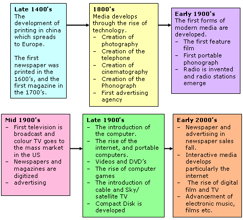
(source: http://www.disabilityplanet.co.uk/critical-analysis.html)
The Kuleshov Experiment
https://www.youtube.com/watch?v=4gLBXikghE0
Kuleshov and Eisenstein experimented with cut up footage in 1910 to 1920. They did this to see how the results would get different responses from audiences depending on what the sequence showed. This experiment demonstrated that the context of a piece of footage is vitally important. Political film makers often used this technique for propaganda purposes.
Thriller Films
Earliest 'thrillers':
- Safety Last (1923)
- The Cat and the Canary (1927)
- The Bat Whispers (1930)
- M (1931)
- Dr. Jekyll and Mr Hyde (1931)
- Murders in the Zoo (1933)
- Gaslight (1944)
- Laura (film noir - 1944)
- The Picture of Dorian Gray (1945)
- The Spiral Staircase (1945)
- The Lady from Shanghai (1948)
- Sorry, Wrong Number 91948)
- The Third Man (1949)
Wednesday, 26 November 2014
Lighting Practice
In order to prepare ourselves for our thriller piece, We practised using light and different shots to achieve the 'thriller' effect.
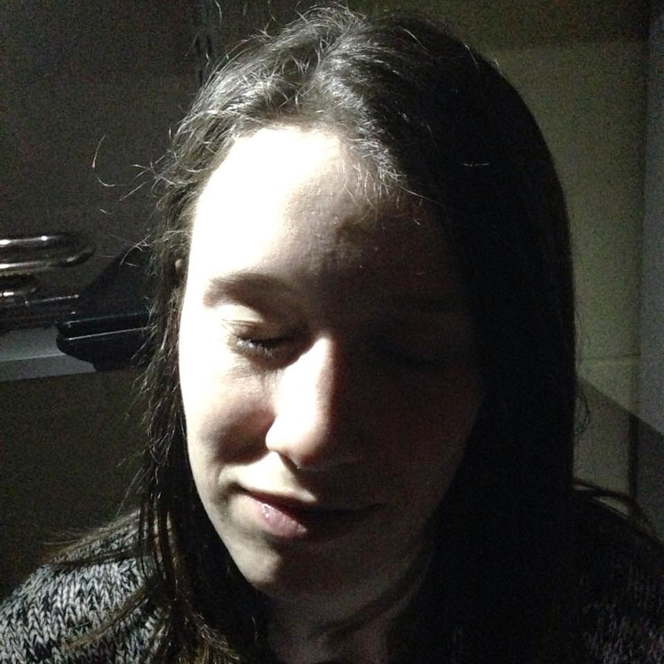
Using a torch on a phone, we took this photo. The light is concentrated on the left of the face, casting the right into darkness. This creates a 'thriller' feel as half of the face is in the shadows.


The different lighting methods could be used within our film piece. I will take these images into consideration when thinking about the lighting in our thriller film.
Saturday, 15 November 2014
Textual Analysis of 'Se7en'
Analysis of a thriller opening. Can be used to gather ideas for our own task.
Subscribe to:
Posts (Atom)